The four ingredients you’re missing from a successful rep-triggered email brief

Having developed rep-triggered emails for both creative agency partners and end pharma clients for nearly a decade, we have a pretty firm handle on best practice – so much so, that we have often shared our top tips for Veeva Approved Emails.

Understanding best practice principles and always putting the field team at the centre of our solutions has enabled us to steer our clients towards some highly impactful email campaigns. However, it doesn’t always go to plan.

In our experience, here are the four pieces of the puzzle that are most often missing, that can lead to delays, miscommunication and sometimes, just downright ugly emails! 

Annotated PDF

To kick off the build of your email, we ask clients to supply us with an annotated PDF so that we can see their vision. When creating the annotated PDF, the following are highly desirable:

  • Links (hosted locally & externally) – where links direct your clients to documents hosted locally, make sure to provide the doc_info number associated with the document(s)
  • Updates – minor text amends (for example, if the PDF contains an out of date DOP/ last accessed date, identifying and adding the required update as a comment is crucial)
  • Logo & Image placement

The flip side of this is a written description of how the email should look and function. Believe it or not, that doesn’t tend to yield the best results!

Artwork

This may sound obvious, but you would be surprised how often we are asked to commence development without any artwork to reference or make use of. Assets such as images, icons, colours etc. should ideally be packages and provided alongside base artwork in a file format tailored to modern web design, such as Adobe XD or InDesign.

Fonts

Oh, fonts. Something so simple, yet overlooked so often that we were compelled to write the CLM best practice guidelines for web font assets

You’ll get all do’s and don’ts around licensing from that article, but what about font usage in emails?

The main consideration here when designing an email is to use a web-safe font. Many web-safe fonts are pre-installed on a wide range of computer systems/ devices, which ultimately reduces the risk of your email ‘breaking’. A list of these web-safe/default fonts can be found here.

A minimum font size of 12px is recommended for the body/main copy of the email, and they should be provisioned in either WOFF2, WOFF, OTF, or TTF format. Colour variations should be supplied with the HTML/ hex code(s), to avoid any minor discrepancies.

If you want to risk using a custom/non-web safe font, then do consider that it will not work on some email clients, most notably the Outlook app, and will use a default system font instead (9/10 times it will be Arial, but older versions of Outlook use Times New Roman).

Size

Quite simply, it is standard best practice to build to a 600 pixel width. If you’re looking for something different to that, then it’s pretty important to state that in the initial brief.

Next steps

Feel like you’ve already mastered the brilliant basics of briefing and want to move onto ensuring your rep-triggered emails are best in class? Stay poised for the next article in this series on getting the most from your RTEs and leveraging under-utilised features.

If it’s all feeling a bit hazy, why not have a read of our what is Veeva Approved Email?’ page or check back again soon for another upcoming article that will break down the anatomy of a rep-triggered email, so that you can impress your peers with all the right technical language.

CLM best practice guidelines for web font assets

Like images or video, fonts need to be licensed from the rights holder for use in any sales aid displayed within a CLM player such as Veeva Engage or IQVIA OCE Remote Engagement. In reality though, fonts can often be a forgotten component in the handover of assets from design to development – an oversight that can lead to real challenges further down the road. Our resident ‘font of all knowledge’ and Chief Technical Officer, Paul Cryer breaks down what you need to know.

The role of fonts in sales aid development

A sales aid without any written content probably isn’t going to get very far in the review and approvals process, so it’s a fair guess to assume then when artwork arrives for development, it’s going to include one or more font choices.

With the nature of CLM presentations being that they can be delivered in-person and ‘offline’ via an iPad, or online via other means such as video calls, it is important to remember that there are two destinations for a font file. When we create a CLM presentation with custom web fonts, we need to be able to:

  • Host the files locally (‘self-hosted’ on the iPad itself) for embedding within pages
  • Distribute the files as part of the CLM presentation deliverables

Let’s talk font licensing

When handing over a sales aid for development, it is preferable to request from the pharma marketing team a brand pack that contains various approved assets. Alongside brand/style guidelines, images and video assets, this may also include unlimited licences to any brand fonts that are used in the sales aid. These web font files can be passed on for use in the project.

One common issue is a lack of web font versions (WOFF/WOFF2 format) of the brand fonts within such a brand pack. However, assuming that the pharma company holds the appropriate licences, the desktop formats that they do possess (OTF/TTF format) can be converted fairly comfortably.

Will a desktop licence suffice?

To be frank, no. Where the creative agency holds a desktop licence to the font(s) that allows them to produce images and print materials, this type of licence will generally permit the conversion of the purchased desktop fonts for web use. Ultimately this means the development of a sales aid can’t progress and the agency would need to obtain licences for web font usage. 

A rare exception to this would be if a solely image-based presentation was being created. The creative agency is permitted to produce artwork using their licensed font, and they in turn allow the developers to use their artwork. No fonts are included inside the project itself, therefore no web font licence is required. If licensing is an issue within a project, this is one of the upsides of our CLM Lite solution. 

What about Adobe TypeKit?

Adobe TypeKit is an online service that provides its subscribers with access to its font library, under a single licensing agreement. A crucial drawback of TypeKit (and various other online services) is that they do not allow for ‘self-hosting’ of the font files. This means that whilst it is possible to use TypeKit fonts inside a CLM presentation, the user will need to maintain a persistent internet connection for the fonts to display correctly, which is a high risk strategy for a rep who may be presenting face-to-face, reliant on public wifi.

Is it worth taking a chance?

If anyone involved in the project is unsure whether the appropriate licences are held, they should double check and then check again. While not owning font licences isn’t the sort of offence that will draw attention from the ABPI, it can carry hefty fines and significant embarrassment and reputational damage for the pharma company. While the cost of a font licence may seem rather high for something that is often seen as being ‘free to use’, the potential price of non-compliance is far greater.

Font licences – the key points to remember

  • Pharma brand teams should provide a brand pack/ brand font assets. These can be converted to the appropriate formats assuming their assets are licensed appropriately. The creative agency should also use these same font files where possible to ensure consistency.
  • If brand assets are not available or the agency decides to use a different font, the creative agency needs to supply web font packages for each typeface used (including italic and weight variations where used) that are licensed for use within the project.
    • If the above is not available, appropriately-licensed desktop font packages (including italic and weight variations where used) that allow conversion to the appropriate web font formats will suffice.
  • Only if the requirement of a persistent internet connection is acceptable, can online services such as Adobe TypeKit be considered – subject to testing.
  • If a ‘safe’ fallback is required urgently, Google Fonts or other open-source providers generally offer fonts under very permissive licensing terms – however, the licence for the specific font should always be checked to confirm it is suitable for our usage
  • Web font formats required for modern iPad compatibility (in order of preference): WOFF2, WOFF
  • Desktop font formats that can be converted to web font format: OTF, TTF

The handover from creative to development can be fraught with complication, so we hope that this guide provides some extra insights on an often overlooked subject. Having been developing CLM presentations for a decade, our team has amassed vast experience in requirements gathering and on-boarding, so if you have any questions about the sales aid development process feel free to get in touch.

Measuring up – reference table for iOS device dimensions

We find that when starting a new project it’s best to have as much information to hand as possible – especially if it’s in an unfamiliar sector like designing for mobile devices. With so many nuances and minor differences even between iPhone or iPad models released in the same year, it’s little wonder that design visuals can go awry from one device to another.

To help overcome this, we’ve created an interactive reference table containing screen information for every iOS mobile device so you can keep this data to hand. The table below features some interactive elements to help you sort by device type, orientation and recency. Don’t forget to bookmark this page, share on social media or forward the link to fellow designers, developers and project managers.

Looking for your next role?

We are now recruiting! Join our team today.

Join our team

iOS device dimensions – reference table

We hope you found this table useful – if you have any feedback or have noticed an error in the data, we’d really appreciate it if you let us know.

How Dashboards Can Drive Deeper Insights

‘Insights’ runs the risk of becoming a massively overused word in the pharma space, having become one of the go-to expressions around any consultancy, marketing, advertising or in fact any businesses boardroom table. An insight can only be drawn if the data from which it was gleaned is accurate, specific, sufficient in volume and digestible. In the pharma industry this has typically been a challenge – which is why the power of the ‘dashboard’ is an important topic.

What do we know about dashboards?

We’re all familiar with dashboards – but in most cases will take their usefulness for granted. Even the most basic of automotive dashboards pulls together data from a number of different sources, such as the fuel tank gauge, mechanical speedometer, radio etc. This dashboard automatically generates insights for the driver such as how many miles we are likely to be able to continue driving until needing to refuel. 

This combination of two accurate metrics to create an ‘insight’ is a simple, but powerful example of how we are all able to make smarter, more informed decisions on a daily basis as a result of a dashboard.

Regardless of the sector, space, input or output, ultimately that is what we are all looking to achieve. In pharma, the technology exists, the next step is the education as to how they can be utilised to drive purposeful, data-led business decisions.

Dashboards in Veeva

There are any number of dashboard providers and solutions out there which all do a pretty good job, the real challenge, and value comes in how well you integrate them with your data sources and ideally your CRM and CLM solutions. In pharma that really only means one thing these days…Veeva. The good news is Veeva already offers a simple, effective and highly customisable dashboard solution, Veeva CRM MyInsights. You can read our guide to getting more from Veeva CRM MyInsights here.

Like any dashboard, the outputs are only as strong as the inputs. In our previous guide, we focused primarily on how medical sales reps out in the field could benefit from having a customisable dashboard of information to hand during a presentation. Opening up data that would previously have been trapped in hefty business intelligence tools or (God forbid) spreadsheets and enabling a sales rep to have present this in person to HCPS through a digital sales aid (DSA) has undeniable benefits when it comes to objection handling and the overall sales process.

However, equally as powerful, is the opportunity to reflect on field data that has been gathered once you’re back at the office. What fresh insights are these sales appointments generating about the motivators and habits of HCPs and how can these insights be used to increase salesforce effectiveness? Also, where dynamic and interactive edetailing solutions have been employed – can the interactions recorded within the appointments be used to better inform design and development decisions?

Essentially it’s a rhetorical question as the answer is ‘absolutely’, however only if content is created in a way that harnesses the power of Veeva analytics.

The power of customised dashboards in Veeva CRM

The ‘out the box’ dashboards in Veeva CRM can be extremely useful. You can view a number of examples in our guide to MyInsights.

Even these pre-existing dashboards can be leveraged to create additional custom insights by working with Veeva Content Partners such as the team here at twentyeightb. However, that’s just where the possibilities start, as with highly customised and interactive edetailing content, comes the opportunity to create additional custom visualizations.

  • Measure the reaction of the HCP to various messages. Test different messaging for different HCPs and gauge the aggregate reaction through a dashboard to implement a test and learn approach.
  • Gather data on the potential use of a drug. Interactive tables and charts allow for data to be collected on the needs of the HCP, that can then be fed through into data visualisations and dashboards.
  • Blended data. There is massive scope to combine data points and ensure that a visualisation is even more striking.

Wondering whether the dashboard in your mind’s eye is possible in Veeva CRM? Get in touch with our team who can provide expert consultancy, combined with Veeva-approved development skills to bring your data visualisation to life. 


Artwork to code: the ultimate checklist for digital CLM project handovers

Planning a new CLM design and development project can be a daunting task – especially when wanting to impress a new client or working in an unfamiliar project area. Our simple checklist contains what we believe to be the key elements for a smooth project handover. We hope this list will boost your confidence and understanding while also reducing pressure so you can focus on the areas where you can add real value to the end client and user.

We also have a downloadable PDF version of the checklist available, should you want to print it out.

Use the RGB colour space for artwork files and in the correct resolution(s) for target devices

Monitors and other device screens work by emitting light, which is why we use the additive RGB colour space. This is the inverse of the CMYK model commonly used for printed materials, where the perceived colour is produced by absorption of light.

It’s important to ensure your design tools are set up to use the correct colour profile from the start, since changing midway through will cause unexpected colour shifts in existing work.

To find the appropriate target resolution, you could use our cheat sheet containing screen resolution information for Apple devices, which is coming soon. Sign up for our resource updates so that you don’t miss out!

Ensure that artwork layers and groups are clearly named

Having layers and groups clearly named makes it easy to locate assets, understand how they should be constructed and helps smooth out the process of exporting files ready for the web. It’s also good practice to reinforce the ‘component’ mindset – meaning elements should be designed for flexibility and reusability in order to give a consistent feel throughout the project.

Guarantee that elements are atomic – not dependent on a specific background colour or other items on the page

Elements should be completely independent and confined to their own layer or group. A great example of this could be a button which is made up of a background layer, a text label and an icon layer – all contained within the button’s group.

Building up elements in this way ensures they are flexible, reusable and contribute towards a consistent feel throughout the finished product.

Additionally, taking the time to prepare an “asset library” for your project will greatly streamline both the design and development processes; reducing the burden of having to make amendments or creating additional page layouts.

Conversely, it’s important to keep in mind that making “quick” changes to shared components could have unforeseen effects elsewhere in the project.

Use pixel values that are a multiple of the target device’s render scale

If an object isn’t aligned to full-number pixel values, it means they won’t map accurately to the device’s screen pixels. Instead, the device must interpret how fractions of a pixel should be drawn to the screen (and isn’t always consistent in doing so). This upsampling effect can cause images to appear blurry or lines to have uneven thickness despite the same weights being set. To avoid this situation, both the physical and logical screen resolutions of your target device(s) need to be taken into account when producing source artwork.

For example, a common target device is the later-generation 9.7” iPad. For these devices, we recommend using positioning and dimension values that are divisible by 2 (this is the render scale value). This ensures logical positions can be cleanly mapped 1:4 with screen pixels, making the final product clear and sharp on-screen.

Confirm that items are aligned to the pixel grid

Following on from the previous point, it’s important to check that your elements are aligned along exact pixel boundaries in the first place. Be aware that this situation usually occurs when drawing new text or vector elements freehand with the mouse. Fortunately, most software packages will have some kind of “snap to pixel grid” option that should be enabled to avoid this problem automatically.

Include additional assets in the artwork package – stock material, videos and fonts etc.

Some software packages such as Adobe Photoshop or InDesign have a “linked file” feature, allowing you to update an asset you’re using in your layout just by updating the file. This is extremely helpful, but don’t forget that you need to package up these files along with your main artwork file(s) when you hand them off for development! In the same way, any fonts or other assets will need to be supplied to make sure the developers get an accurate representation of your design when opening the files at their end.

Add notes and other documentation from the design process

The design process is a tricky one, requiring collaboration between multiple different parties and a lot of decision-making. Naturally, we love to be included in this process, but we – as a development partner – understand it’s not always feasible on every project.

As such, the important thing to remember is that every meeting produces ideas, decisions and plans that become indispensable documentation for your project. This often gets overlooked, but it’s essential for bringing people up to speed on the status of the project. Having information like this on-hand, speeds up the onboarding process and ensures your developers will get a complete, rounded view of the challenges and proposed solutions at hand.

Be certain that licensing terms for any third-party assets are met

Licensing for things like fonts can get very tricky, especially when dealing with the issues of embedding them in web content and distributing through a CLM platform such as Veeva. It’s best to check with the license holder to see which licenses they offer that meet your exact needs. Alternatively, if you need a “safe” option, the Google Fonts suite offers a wide variety of typefaces with generous licensing terms suitable for use in CLM or web content.

We hope you find this checklist useful for your own projects. If you’d like to print it out or share it with your co-workers, we have a downloadable PDF file available here. If you’d prefer an interactive digital version of the checklist, tweet us for access!

We’re always on hand for advice on smoothing the transition between design and development on Veeva CLM projects, so if a checklist simply isn’t enough, get in touch with us today to see how we could help.

Moving to Veeva: What are your options?

You’ve been told your pharma field force (or your client’s sales force if you’re an agency) is moving over to Veeva CLM and the next eDetails aid you produce has to be built in Veeva. So, what are your options?

What is Veeva?

Veeva is a cloud-based software company specialising in CRM systems for the pharmaceutical industry. It is used by more than 600 life science organisations, including 49 of the top 50 largest global pharmaceutical companies. 

The company has four core offerings – Veeva Vault, CLM, Network and OpenData – in addition to Veeva Commercial Cloud, which is being used by increasing numbers of commercial customers worldwide. 

PowerPoint to Veeva

Veeva recently introduced support for Microsoft’s flagship slide presentation program, PowerPoint. If your field force currently uses PowerPoint to present to customers, you can simply upload your .ppt file to Veeva Vault and distribute it to your field team. Users simply open the file via Veeva iRep and, as long as they have MS PowerPoint installed on their iPad, away they go.

Upside: Simple, quick, and because it can be done without specialist help, if you already have the .ppt file it’s pretty much free.

Downside: Clumsy (opens the MS PowerPoint app), very limited analytics (only that the presentation was opened), not optimised for iPad and not fully integrated with Veeva CRM, so users cannot utilise other multichannel activity, such as Approved Email.

We recommend this option when your current sales materials are in .ppt format and:

  • there is limited or no available budget;
  • it’s for a small specialist sales team;
  • the detail aid is a one-off or only to be used for a short time period;
  • or there is no requirement for analytics or business insights.

PDF & flat image to Veeva

Veeva CLM presentations support the use of PDFs and image files as simple non-interactive slides that can be put together to create a very basic digital sales aid.

Upside: Simple, quick and requires very limited specialist help – if you already have the content then the cost is low.

Downside: Limited analytics (only which slides are seen), flat content, no interactive elements, limited navigation options and not optimised for iPad.

We recommend this option when your current sales materials are in PDF or flat image format and:

  • there is limited or no available budget;
  • it’s for a small specialist sales team;
  • the detail aid is a one-off or only to be used for a short time period;
  • or there is no requirement for analytics or business insights.

Content adaptation – CLM to CLM

If you already have an HTML5-based eDetails aid, either as a standalone web app or in-built for another framework, such as Agnitio, MI Touch (Nexxus) or Vablet, then it can be dropped into a single Veeva “slide”. This is sometimes called a “Veeva Deep” CLM solution.

You’re likely to need the help of a Veeva approved developer as there will be functionality that needs adapting between frameworks, but as long as the original code has been well put together, their involvement should be relatively light.

Be warned, however; if the source code has been poorly written then your specialist developers may well recommend starting from scratch, as the cost to adapt poor code often spirals out of control.

Upside: Low friction transition for the field force, existing presentation assets reduce the time impact of design approval, so can be relatively quick and may only require moderate intervention from your specialist developer.

Downside: Limited analytics (Veeva will only show one slide has been opened), potential for very large file sizes leading to slow upload and sync times, navigation, transitions and overall performance may be poor when compared to a presentation built specifically for Veeva.

We recommend this option when you really like your current detail aid and what you really want is as little disruption to your field force as possible. Whilst it’s not really a long-term solution, it’s an excellent way to limit friction during your transition to Veeva CRM.

Bespoke Veeva development

A Veeva accredited developer can work with you and your creative agency to plan, design and build a bespoke Veeva CLM that will help you and your field team realise the potential this platform has for positively impacting your brand’s performance.

A bespoke Veeva CLM solution allows you to take full advantage of Veeva’s Closed Loop Marketing functionality. It can provide real-time feedback to the rep to improve their territory management, customer segmentation activity and in-call selling success.

With well designed content, a Veeva CLM presentation can also provide you with business-critical market insights and track the progress of your KPIs. For more information about the insights you can achieve with Veeva, please refer to our guide on Veeva CRM MyInsights.

With the right approach and the right experts on hand to support you, producing a Veeva-wide CLM does not need to be expensive. Although this approach will likely require the most development time, if coded well, a Veeva-wide CLM will deliver significant ROI over time as future updates, adaptations and even localisation will be easier, quicker and considerably less expensive to undertake.

Upside: This is how Veeva is meant to be used.

Downside: To do it well you need time, planning and budget.

We would recommend pharma brand teams and their marketing agencies take this option whenever possible.

Next steps

To learn more about Veeva CLM solutions, please get in touch with our Veeva Multichannel Partners on +44 (0) 1480 877 321 or drop us a line via our contact form to discuss how 28b can help you maximise the potential of Veeva for your brand.

Using behavioural profiling to understand HCP drivers and motivations

We live in a time of rapid change and that’s perhaps especially true when it comes to medicine and life sciences. Breakthroughs and new approaches can be revolutionary and life-changing, and are matched, it seems, by fundamental changes to the functions that underpin dissemination of information. After all, the best treatments in the world will do no good unless the right people are made aware of them.

These changes are arguably driven by the new ways in which healthcare professionals (HCPs) seek and prefer to receive information. This puts them in the driving seat – rather than reps taking information to HCPs, HCPs instead look for information at times, and in the ways that suit them best.

More HCPs than ever are digitally savvy, and are comfortable browsing for information and communicating digitally. As a consequence, pharmaceutical roles must also evolve and adapt to this new digital landscape. Busy HCPs might not want a face-to-face appointment, for example, and so new ways of communicating are required. This can be challenging as communication becomes customer-led. One way to get reps back into the driving seat is to better understand the needs of HCPs.

DSAs – digital sales aids – are forms of digital content produced to facilitate, support and enhance dialogue between pharmaceutical sales representatives and HCPs. While most have long been using electronic presentations via tablet PCs, the opportunities offered by digital are starting to be more widely leveraged.

For example, it’s possible to develop content beyond the static, flat PDF-style that was once commonplace in the industry. Functional content – more engaging presentation of information that enables data collection, personalisation and a more compelling and versatile narrative to be told by reps – is very much the future. This enhanced approach to development for platforms such as Veeva’s CLM, brings data to life and creates opportunity to embed more interactive media such as video and fields to input data in real-time, during the meeting.

These sorts of customer relationship management (CRM) systems allow information about different types of interaction – such as website usage, social media engagement, and communication via email or live chat – to be captured, which provides deeper insights into customer behaviour and engagement.

That knowledge can help develop an informed and effective multi-channel approach of marketing to HCPs. The blend of channels used will depend on the nature of the treatment approach and the behaviour of the target market. Prime channels can be leveraged while those that offer little engagement – in this situation at least – can be set aside.

A multi-channel marketing strategy must be both robust and adaptable, and digital lends itself to a nimble response. Different approaches can be tested on a small scale, assessed, and then the most effective rolled out.

Behaviour types

In addition to there being benefits in using multi-channel approaches, it should be recognised that different HCPs access and process information in different ways, based on their psychological framework. Here we take a look at the key aspects of four main behaviour types to offer an insight into their motivations, and what that means for DSA design.

1. Competitive, direct and impatient

  • Scans rather than reads – emphasise headings, categories and benefits

  • Wants key points, fast – include a search function

  • Needs to be reminded and prompted – add value propositions to each page

2. Methodical, logical and detail driven

  • Makes informed choices – include facts and figures

  • Reads all available information – include links to additional material

  • Trusts others’ informed opinions – include reviews and expert opinions

3. Spontaneous

  • Makes decisions based on emotion – appeal to their feelings

  • Prefers pictures to words – make sure text is broken up with appropriate imagery

  • Has a short attention span – offer snappy, memorable phrases and shortcuts

4. Humanistic

  • Influenced by a sense of inclusion – use a creative approach, including storytelling

  • Responds well to emotion – use images that illustrate feelings

  • Trusts the opinions of others – showcase quotes, especially where emotion is expressed

Using a mix of information and styles allows pharmaceutical companies to satisfy the needs of different types of HCP, which increases the chances of them accessing what they have to offer.

We can help

Understanding where and how HCPs look for and consume information can afford significant competitive advantage. Adopting a multi-channel approach underpinned by behavioural profiling can increase reach, frequency of interaction, and customer satisfaction. Multi-channel approaches backed up by a mix of DSAs allow for the wide-ranging and evolving needs of HCPs to be met. Get in touch today to discover how twentyeightb can help.

Is modular content key to controlled and cohesive pharma comms?

Control has often been a key phrase in pharma, with regulations determining the way in which pharmaceutical companies and their reps can – and more importantly, cannot – communicate with healthcare professionals (HCPs) and the general public. But where does a modular approach come into this?

What is modular content?

Modular content essentially describes the method of developing components that can be reused and dynamically update – in turn providing centralised control over content could exist in multiple locations and contexts.

In web development circles, the concept of modular content is fairly tried and tested. Borne out of a desire to reduce development overhead in updating multiple instances of similar components, it is embedded in a lot of the best practice around website development on popular content management systems (CMS’s), such as WordPress, Drupal and Joomla!.

In pharma terms, modular content has typically been framed slightly differently. While website developers may use the approach primarily as a means of economising effort, software and systems developers in pharma would adopt modular content primarily as a means of control.

How can pharma adopt a modular approach?

In some respects pharma brand teams and agencies may already be working in a modular way, but without really realising. Veeva talk about ‘modular response content’ that is managed from Veeva Vault MedComms and how it provides a central point of truth. When harnessed correctly, this technology streamlines operations, centralises information and provides greater opportunity for data collection and analysis.

Modular content in pharma email communications

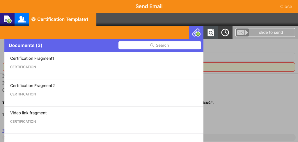
Features within Veeva Approved Email are constructed and inputted using a modular framework. The software admins retain control of the content, providing it to the rep as list of approved messages to choose from. Crucially, this ensures that the communication shared with HCPs is moderated and – as the name states – approved. These modules are referred to as ‘fragments’ within individual emails, as shown in the example below.

veeva approved email screenshot

To get a better understanding of how to use Veeva Approved Email for better sales outcomes, read our VAE introductory guide or watch the first in our series of video tutorials on VAE best practice.

Modular content in CLM presentations

Customisation of content is a key factor in CLM effectiveness and modular content puts more options in the hands of the rep, without compromising compliance. By having the option to drag and drop different graphical elements, charts and diagrams into a dynamic edetailer, pharma sales reps can take greater control of the narrative that they feel will influence the decision of a HCP.

Make sure you plan for modular content

For modular publishing to work, a thorough upfront assessment of requirements and a detailed specification that covers every eventuality needs to be produced. Planning for every instance where modular content may be required and then inputting the content that can display within those fields should set you on the right footing – however there is no substitute for consulting with Veeva specialists who understand the nuances of this incredibly powerful platform.

Digital design tools to share with your studio

DSAs and e-detailers are crucial tools when it comes to helping HCPs engage with a new pharmaceutical products. Unlike paper-based handouts, e-detailers make content more interesting, allow for greater understanding of data via interactivity, and help pharma marketers to analyse and hone communications on a personal level.

So making sure you have the right digital tools throughout the design process is vital. That’s why we’ve put together a rundown of our favourite tools for designers working in pharma, and how they can enhance your design process. Hopefully there are a few hidden gems below that you may not yet have discovered.

Sketch

An excellent tool for UI design, Sketch is a vector-based design app for Mac. Lightweight, fast, and incredibly easy to use, Sketch incorporates an intuitive interface with Sketch Cloud libraries that make collaboration a breeze throughout development.

Designers in pharma will particularly enjoy Sketch’s huge range of optional plugins, which cover everything from creating user flow diagrams to prototyping your designs.

Licensing is pretty straightforward; you can opt to pay once and use Sketch for as long as you like, although this won’t entitle you to any updates. Otherwise renewals are yearly.

InVision

If you’re looking for a dedicated prototyping tool, InVision is an excellent option. Perfect for working on development with external agencies, InVision allows you to create interactive prototypes of your DSAs.

Collaboration is made easy via an in-app commenting mode while the clever Build Mode allows you to test interactivity – ideal for perfecting your edetailing design.

InVision offers several different payment plans depending on your needs, with the number of active prototypes allowed differing according to price.

Adobe XD

If you’re a dedicated Photoshop fan, you’ll love this interactive prototype designer from Adobe. Like Sketch, XD is vector-based and streamlines the entire design process from wireframing to development.

Adobe XD supports integration with Adobe Suite as well as plugins and other tools like Slack for communication with your team and agencies. Animated prototypes are particularly useful for designers working with e-detailing.

You can sign in to Adobe XD using your Adobe ID and opt for monthly licensing or renewal every 99 days.

Pixlr

Pixlr is a powerful browser-based editing tool that comes with both a free and a paid Pro version.

A great option for designers on the go, Pixlr works as an alternative to Photoshop and its cloud-based service is especially useful for collaboration. Images can be easily shared and edited between teams.

It is compatible with all major browsers, while Pixlr Pro offers access to more advanced editing tools and comes with a monthly or quarterly subscription.

Avocode

When it comes to design hand-off, Avocode has all the bases covered. Compatible with Sketch, Adobe XD, Photoshop, Illustrator, and Figma, Avocode allows you to share and collaborate on designs across Mac, Windows, or Linux.

Especially useful for perfecting designs on mobile devices, Avocode is great for e-detailer designers who will love the easy exporting, innovative code generation, and advanced rendering engine.

Subscriptions are available for one user to over 10 users and you can choose between monthly or yearly billing as well as test out Avocode with a free 14-day trial.

Easing the transition from design to development

Having access to the right tools is essential for creating the sort of sound, signed off designs that are the bedrock of a successful e-detailing solution. We hope you’ll find these tools useful for creating designs capable of driving positive sales outcomes for HCPs in the field. If you’re looking to progress your designs through to development but don’t know where to start, get in touch with our DSA development experts to have your questions answered.

Listening to the silent majority – UX feedback your visitors aren’t sharing

This is the third and final article in a series based on a talk that Nick Woolnough – Head of Marketing Operations at StrategiQ – gave at the Pharma Multichannel Marketing Meetup in December 2018. Following on from the importance of realistic expectations and an opportunistic approach to web content, this article goes on to look at learning from the increased number of visitors that your website is hopefully now receiving.

Transitioning from “visitors captured’ to “visitors converted”

In my last article, I discussed some tactics for acquiring new web traffic in your niche and how pharma companies in particular can deep dive into their areas of specialism to produce unique content that meets demand. Unfortunately, more traffic doesn’t always mean more conversions – if only digital marketing was that simple! When you are generating an upsurge in traffic through content marketing, it is likely that you are attracting a lot of ‘top of the funnel’ traffic that typically is even less likely to convert to business in the short term. As such, this traffic is ripe for analysis as the audience will typically be more varied in terms of intent and interests.

What do you do when it’s not working?

If traffic is increasing but conversions aren’t following suit – questions are usually asked of the marketing team behind the content strategy and the way in which budget and resource has been invested.

How brand and marketing teams react in this scenario is critical. Is it seen as an opportunity to learn from new data or a cause for panic?”

The temptation can be to use this as an opportunity to reinforce preconceptions and opinions about the website.

“I told you we should have put a link to our solutions in the secondary navigation.”

“That enquiry button has never been big enough, we need to make it orange too.”

These are the sorts of things you could typically hear in a session to analyse a drop in conversion rate. It’s all subjective, but if your new website visitors aren’t providing you with feedback then that’s all you’ve got to go on, right? Yes, but only if you didn’t have the foresight to put in place measurements at the start of the campaign.

Pulling on your data sources

As a bare minimum, most websites will be running some sort of web analytics software; most likely Google Analytics. With some forward planning there are great ways of enhancing the data collected within that platform and even better, overlaying it against something more visual.

sample Analytics data

Behavioural analytics tracking tools such as Hotjar and VWO allow you to actually observe the way in which visitors are using your website. All of a sudden that majority of users who weren’t leaving a tangible imprint of form completions or enquiries on your website become far more real, allowing you to derive action and a pipeline of website improvements based on real user data.

Heatmaps

Some of the quickest of quick wins when it comes to optimising your website for user experience can come from observing heatmaps. Set up on the pages that you wish to analyse, these can allow you to quickly identify if visitors simply aren’t finding the on-page elements that you view as most important or compelling – be that a video, content form or key sales message. By knowing – per device type – how much of a landing page the majority of your web visitors are actually viewing, you can make some pretty bold, data-backed decisions as to how you prioritise your content.

User Recordings

Here’s where it gets really interesting. With the exception of looking over someone’s shoulder on the tube or in a cafe, you won’t get much closer to charting a visitor’s journey on your website than through watching back user recordings. These screen captures follow the mouse around the website, giving you complete visibility as to what elements of the page drew attention and also those that didn’t. The danger for marketers here is the time it takes to analyse multiple screen recordings. While heatmaps are aggregated, these are not, so you need to be careful to use filters to tackle one landing page or predetermined user journey at a time. Key things to look out for include the mouse hovering over an on-page element for longer than usual, attempted clicks that don’t seem to result in an action or users scanning past content or elements you assumed they would find useful or engaging. By collating these findings, you can derive some genuine insight.

Feedback Forms

If the above fails and the silent majority still aren’t telling you what you need to hear in order to improve your website performance, then ask them! Pop-up feedback forms are becoming more commonplace and enabling these gives you a chance to overlay some qualitative data against the more quantitative data that heatmaps and recordings can provide.

So even if your website users aren’t making a whole lot of noise, it doesn’t mean we can’t listen to them. The opportunities don’t end with websites either, so if you’d like to find out more about how advanced analytics can help you get more out of your digital sales aids, why not fire a quick question across to the team at twentyeightb.