Veeva Sunrise UI – key interface updates to look out for
May 2018
Early access – take a sneak peek at the highlights and key features from Veeva’s new Sunrise User Interface.
Veeva’s all new Sunrise User Interface is a ground-up rebuild, completely refreshing the look and feel after six years.
All Veeva CRM for iPad users will receive the upgrade automatically as part of the 18R2 release August 2018.
They have focussed on streamlining the user experience, with a smoother workflow that requires fewer clicks to access information and take actions.
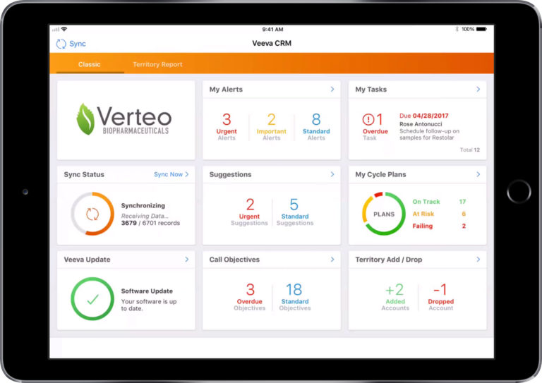
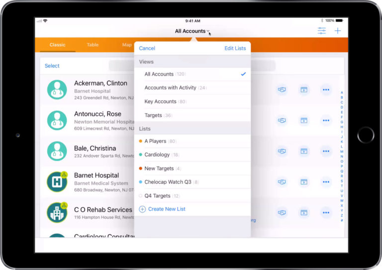
At its core is a dashboard providing immediate access to a wide variety of information, without having to dig through several layers of screens to locate it.
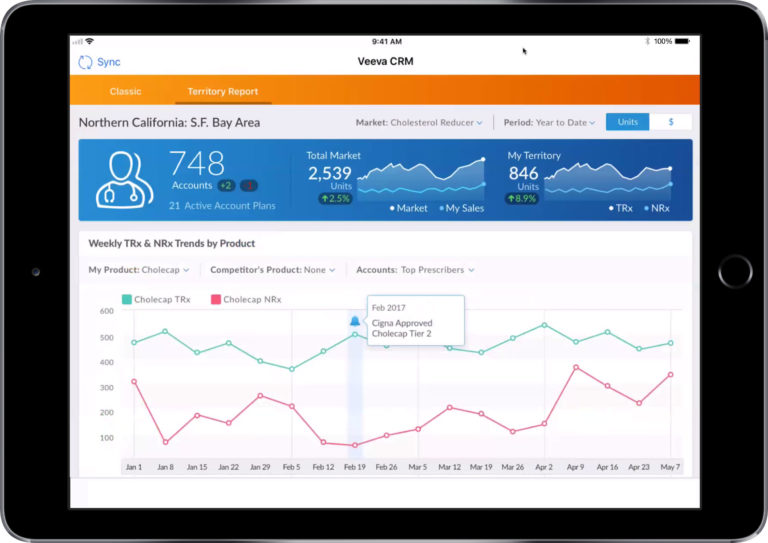
The orange bar at the top of the screen – the Sunrise bar from which the UI takes its name – provides quick access to reports. It is worth noting that this will not appear in Media Presentations as existing DSAs do not need to be redesigned to fit into a smaller screen size – the Media Player still takes over the entire screen.
Across the bottom of the screen are icons to access the usual tasks needed to be completed during the average working day for field force representatives.
A lot of work has been put into maximising the screen real estate available for information and minimising the clutter of components and controls. The account list now spreads right across the screen.
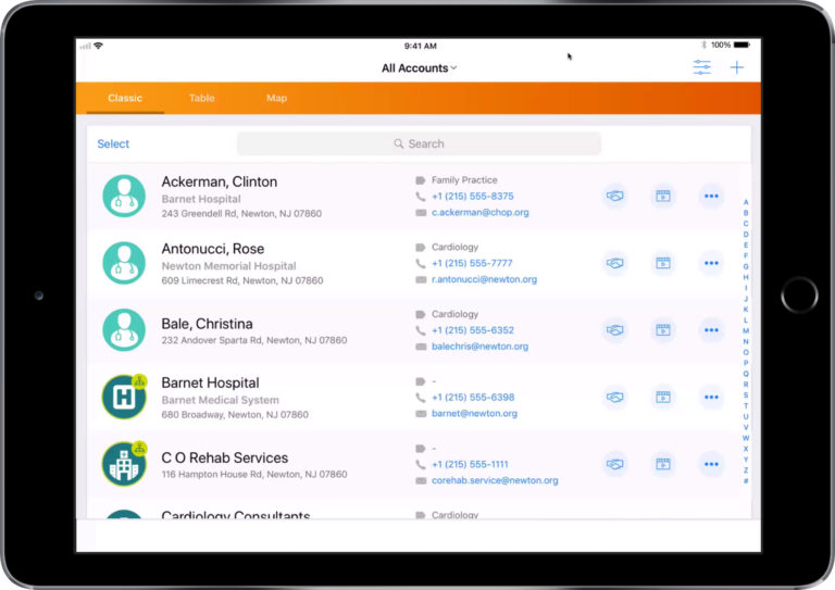
Also, actions can be completed directly from the account list, reducing the number of click throughs needed.
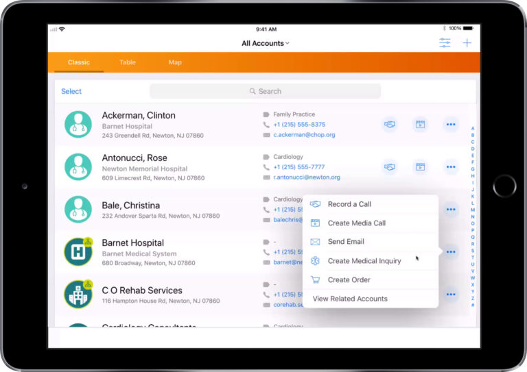
Filtering of the account list can also be performed directly from the same screen, the search bar has moved and the entire screen width is now utilised.
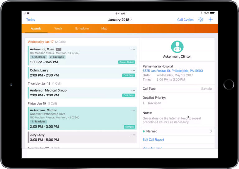
There is now a combined view of account and call history information, streamlining access to data by holding everything in a single screen:
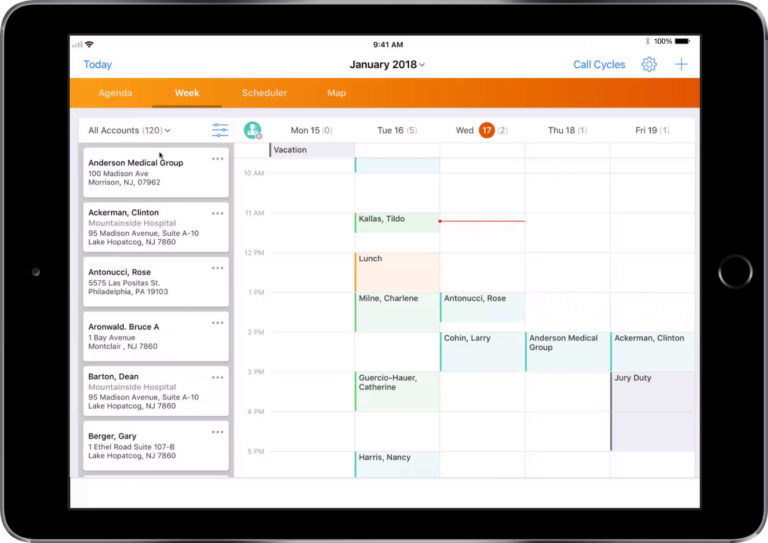
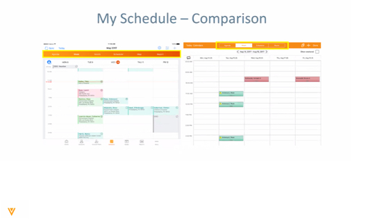
The calendar view has been reworked to give a high level overview of diary and accounts in the same place:
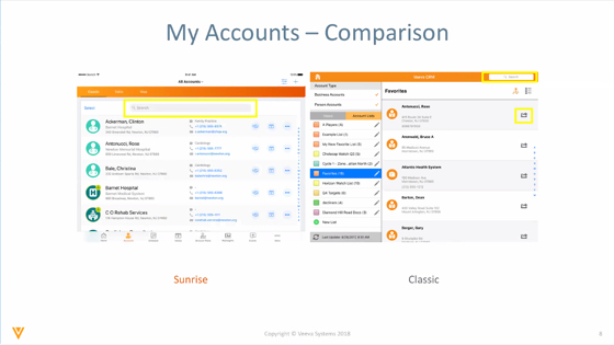
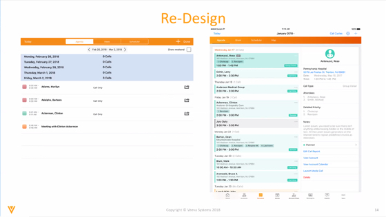
Comparing the new Sunrise interface to the old
The accounts screen is now far more streamlined with much more information available at a glance:
And the cards in the calendar are now packed with information to make them far more useful:
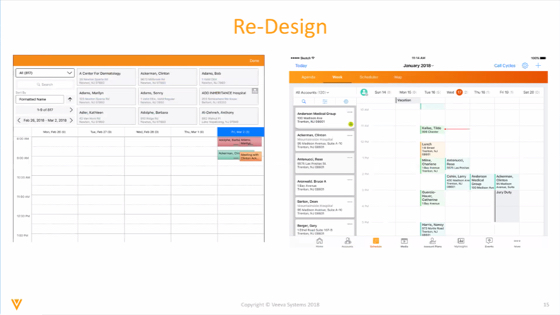
The Agenda view has also been reworked, again with an emphasis on providing extra information within a single screen.
Calendaring is also improved with the creation of appointments being made much easier with a direct view of the dates and times.
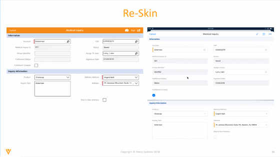
Certain screens have not been totally redesigned but have been re-skinned for a much cleaner and more current view.
All the latest Veeva CRM updates
As Veeva Multichannel Partners, we regularly have the opportunity to review new features before they are rolled out. If you don’t want to miss our updates, make sure you subscribe to our newsletter.
[newsletter]